Art has always been my language of choice. It allows me to communicate emotions, histories, and identities that words alone can’t always capture. Through mixed media, collage, and abstract imagery, I create work that bridges personal narratives with broader cultural dialogues. My process is rooted in the idea that life is layered, complex, and often contradictory—full of both structure and chaos. I am drawn to the interplay between these elements, finding beauty in the tension between control and spontaneity.
Each piece in this series is an exploration of controlled chaos, where intention meets unpredictability, and identity is built from fragments of history, memory, and experience. The clean lines in my work represent structure—discipline, resilience, and the ability to forge one’s path. Meanwhile, ink splatters and textured layers symbolize the raw, unfiltered moments that shape us, the unplanned disruptions that lead to growth.
This body of work is not just about artistic expression—it is a reflection of survival, adaptation, and transformation. It is about honoring the past while making space for the future. It is about embracing the messiness of life and turning it into something meaningful. Here’s a deeper look at each piece and what it represents.
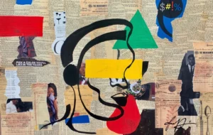
Lost Frequencies is about miscommunication, distortion, and the struggle for clarity in a world oversaturated with information. The background is composed of torn book pages, newspapers, and fragmented media, creating a dense, chaotic backdrop. Over this, I painted a fragmented human face in profile, wearing what appears to be headphones, with bold color blocks obscuring the eyes and mouth. The yellow bar over the eye represents blindness or hidden truths, while the red shape covering the mouth symbolizes silencing, censorship, and the struggle to be heard. The speech bubble containing $#%! references how conversations often get lost in noise and conflict. The headphones could represent selective hearing or tuning out of important conversations. At its core, Lost Frequencies is about how messages get lost, misinterpreted, or suppressed—especially within marginalized communities. It speaks to the difficulty of being heard in a society that often distorts narratives.
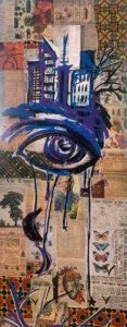 They Say Men Don’t Cry is a direct challenge to the societal stigma around male vulnerability, particularly within Black communities. A large, deeply expressive eye takes center stage, painted in rich blues and purples, shedding long drips of paint that form tears. Above the eye, a city skyline is positioned like a crown or a heavy burden. The tears symbolize repressed emotions, pain, and the cathartic release that comes with allowing oneself to feel. The city skyline represents the societal weight and pressures that often silence men’s emotions. The background collage, featuring kente cloth and historical newspapers, blends themes of heritage, resilience, and external expectations. By blending urban imagery, cultural motifs, and personal emotion, They Say Men Don’t Cry seeks to normalize emotional expression and dismantle outdated ideas of masculinity.
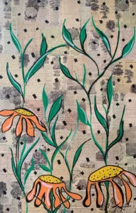 Wilt & Rise is a meditation on resilience and renewal, using natural imagery as a metaphor for struggle and growth. The foreground features three drooping orange coneflowers, their petals curling downward, yet their stems remain strong, stretching upward toward the sky. The coneflower is often associated with strength and resilience. This symbolism stems from its ability to thrive in challenging conditions, such as poor soil and drought. The background consists of antique botanical illustrations and handwritten pages, reinforcing themes of growth and history. The wilted flowers symbolize moments of hardship, exhaustion, and temporary setbacks, while the upward-reaching stems represent perseverance, rebirth, and the ability to push forward despite adversity. The collaged text and plant diagrams remind us that life is cyclical, and everything—including struggle—has a place in our journey. Wilt & Rise is a testament to survival and transformation, acknowledging that even in our weakest moments, growth is still possible.
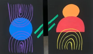 Matrimony explores the delicate balance of unity and individuality within relationships. The composition features two distinct but interconnected forms, one in cool tones and the other in warm hues, representing the merging of different energies. The use of symmetry and contrasting colors emphasizes the dynamic tension between two separate entities coming together. The intertwining patterns within the forms symbolize communication, compromise, and the intricate dance of partnership. Matrimony reflects on the ways in which relationships shape and transform us, celebrating both harmony and the challenges that come with true connection.
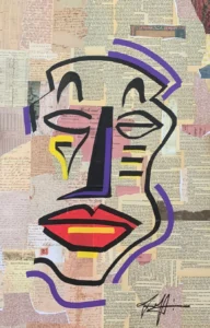 The Mask We Wear is inspired by Paul Laurence Dunbar’s poem “We Wear the Mask” and delves into identity, performance, and the façades we present to the world. At the center is a bold, mask-like face, outlined in black with exaggerated features and asymmetrical expressions. The background is a collage of vintage documents, letters, and text, symbolizing the hidden layers beneath our exterior. The fragmented features suggest how identity is constructed and often shaped by external expectations. The red lips and purple facial accents highlight the tension between authenticity and performance. The collaged background reminds us that our identities are layered, complex, and shaped by personal and collective histories. The Mask We Wear asks the viewer: How much of what we present to the world is truly us? And how much is a carefully constructed mask?
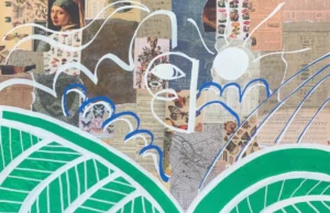 Mother, Watch Over Me is about a child leaving home to find their place in the world. It reflects the lessons taught and the prayers spoken over them, serving as a source of protection and guidance as they navigate both failure and success. The central figure, outlined in glowing white, hovers over large green leaves, symbolizing the nurturing foundation provided by those who raise us. A single eye watches downward, a maternal presence that continues to offer wisdom and support even from afar. Above, a circular sun or halo radiates light, representing the enduring protection of a mother’s love and the ancestral spirits that walk with us. This piece captures the emotional journey of stepping into the unknown while carrying the strength of where we come from. It is about resilience, the unseen forces that shape us, and the knowledge that even as we forge our own path, we are never truly alone.
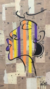 Gilded Soul is a meditation on inner worth and self-identity. The central figure is a minimalist human profile outlined in black, filled with vertical gold, orange, and purple bars—reminiscent of a barcode or prison bars. Gold represents intrinsic value, dignity, and worth, while the bars suggest both confinement and illumination, questioning whether the soul is trapped or shining through. The background, composed of financial documents and newspaper advertisements, raises questions about how society measures worth. At its heart, Gilded Soul challenges us to recognize our own value beyond societal labels or limitations and serves as a reminder that external perception does not define personal worth.
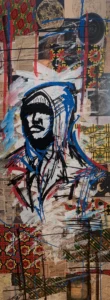 Hood Adjacent is a bold commentary on urban identity and societal perception, featuring a hooded figure rendered in quick, expressive strokes, surrounded by a collage of African kente patterns, celestial maps, and historical text. The hoodie symbolizes urban culture, identity, and often, racial stereotyping. The kente cloth patterns honor African heritage and resilience, while the celestial imagery suggests higher aspirations and a connection to something greater than one’s immediate surroundings. This piece asks the question: How do we define where we belong? And how does society perceive us in return? It challenges viewers to confront biases and assumptions about communities often marginalized or misunderstood. The deliberate juxtaposition of earthy textures with cosmic references highlights the tension between grounded reality and aspirational dreams. Hood Adjacent invites contemplation about the invisible boundaries we place around neighborhoods and cultures, questioning whether proximity alone can truly bridge or create divides.
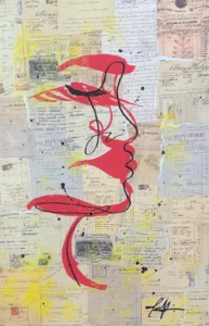 Red Thread is a meditation on love—its resilience, its quiet power, and its ability to exist beyond time and space. A single red line forms the outline of a human profile, weaving through a background of antique documents and letters. This unbroken line represents the unseen forces that bind us together, a connection that defies distance and circumstance. Love is not always spoken; it is felt, imprinted on our lives like the ink on aged paper, lingering in the spaces between words.
The red thread symbolizes devotion that transcends physical presence, stretching across lifetimes, anchoring souls even as they move in different directions. The layers of historical documents suggest that love, like identity, is shaped by those who came before us, by whispered prayers, by unseen sacrifices, and by the longing to be understood. The fluidity of the black line illustrates that love is not rigid or confined—it bends, curves, and adapts, yet remains whole. This piece is a reminder that love endures, threading itself through memory, history, and the spaces between us, always pulling us back to one another.* reminds us that we are part of something larger, interwoven into a greater tapestry of history, love, and shared experience.
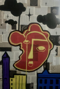 Between Heaven and Asphalt explores the tension between dreams and reality, the sacred and the struggle. This piece is about the pursuit of something greater while being deeply grounded in the harshness of life. The composition layers urban textures with celestial imagery, symbolizing the balance between aspirations and survival. The use of bold contrasting elements—a structured skyline against organic, fluid forms—reflects the inner conflict of striving for something beyond the immediate while remaining tethered to one’s environment. This work acknowledges the beauty in the grind, the holiness found in perseverance, and the reality that heaven and struggle often exist side by side. Between Heaven and Asphalt is a visual meditation on faith, resilience, and the spaces where dreams and reality collide.
THANK YOU!
Thank you for taking the time to experience this show, whether in person or in thought. Your presence, your reflections, and your support mean everything. Controlled Chaos will be on display at the Academy of Fine Arts in Lynchburg, VA, throughout the month of March. I hope it sparks something in you—whether a new perspective, a conversation, or simply the affirmation that you are not alone in your journey to becoming whole.


M. Hall March 8, 2025
I’m so proud of this body of work. Your intentionality behind each piece is seen. The work is beautiful on its own- having the insight & explanation for each creation enriches each piece. Thank you for taking the time to create.
Natalie Obeng March 8, 2025
Absolutely so very happy and proud of this collection of work. The canvases are outstanding and when I read the statement piece for each one of them giving more depth and meaning behind the concepts WOW!!!
You Son of my heart have an amazing depth and wealth of God given gifts and talents and I just love how you express them. 💞 Continued Blessings
Comments are closed.